Scaling FlightHub through design systems.
How I aligned Product, Engineering, and leadership around a shared design language as FlightHub expanded beyond flights.
Project overview
- Role
- Senior Product Designer
- Company
- FlightHub
- Timeline
- 2025
- Team
- Product Design, Engineering, Product Management, Brand, and executive leadership
- Responsibilities
- Design systems, product strategy, UX research, stakeholder alignment, design operations, and AI workflow design
- Outcome
- Introduced and drove the adoption of a shared design system that unified FlightHub's product experiences, reduced duplicated design effort, and became the foundation for AI-assisted prototyping.
Impact
As FlightHub expanded beyond flights into Hotels, Cars, Packages, and other travel products, the need for consistency became increasingly important.
By introducing and driving the adoption of a shared design system, I helped establish a common design language that reduced duplicate work, improved collaboration across teams, and created a scalable foundation for future product development.
The system eventually extended beyond traditional design workflows. By translating its principles into a Claude Code skill, I enabled designers, engineers, and product managers to generate prototypes that already reflected FlightHub’s design language.
A shared product language
Created greater consistency across Flights, Hotels, Cars, Packages, and related booking experiences.
Reusable product patterns
Reduced the need for teams to repeatedly design and implement common interface patterns.
Better cross-functional alignment
Gave Design, Product, and Engineering a shared reference point for product decisions.
Design-aware AI prototyping
Helped AI-generated prototypes look and behave more like FlightHub from the beginning.
Diagram: Flights, Hotels, Cars, Packages, and Checkout are all supported by one shared design system foundation.
The challenge
When I joined FlightHub as a Product Designer, the company was evolving from a flight-first booking platform into a broader online travel agency.
As the product organization grew, every designer naturally developed their own conventions for typography, spacing, layouts, and interaction patterns. Individually, those decisions made sense; together, they added up to a fragmented customer experience. The inconsistency was easy to see in the UI, but its roots were organizational: with every new product, keeping the experience cohesive got harder. I saw an opportunity to create a shared foundation that could support the company’s growth.
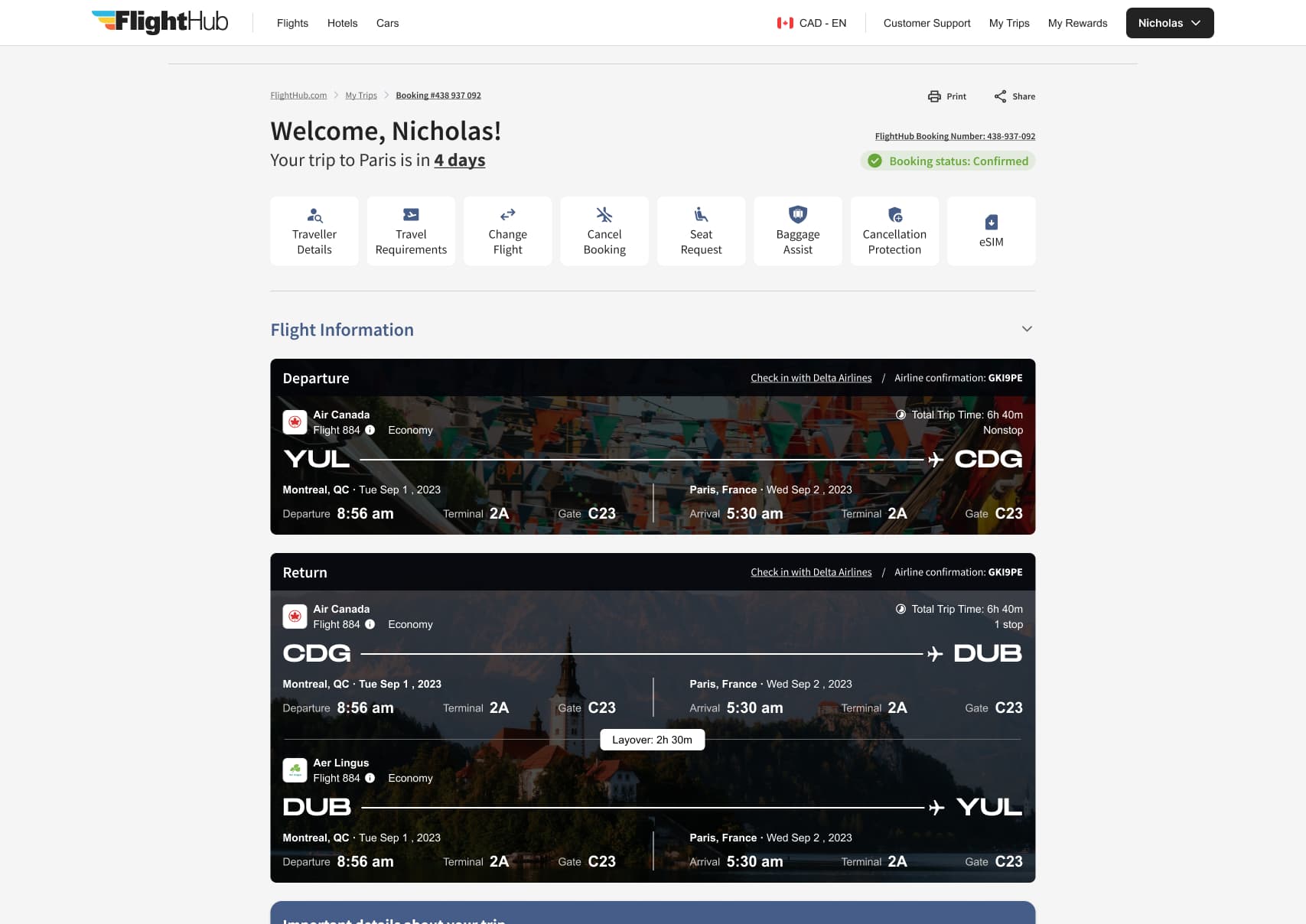
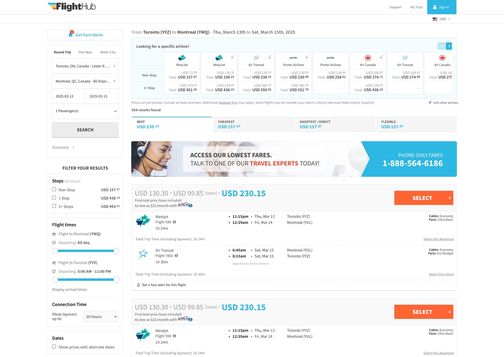
Comparison: before the design system, the My Trips, Flights, and Packages experiences each used their own cards, spacing, buttons, and typography. After adopting shared patterns, the Flights, Hotels, and Cars experiences share one consistent structure and component language.
Before the design system
My Trips
Flights
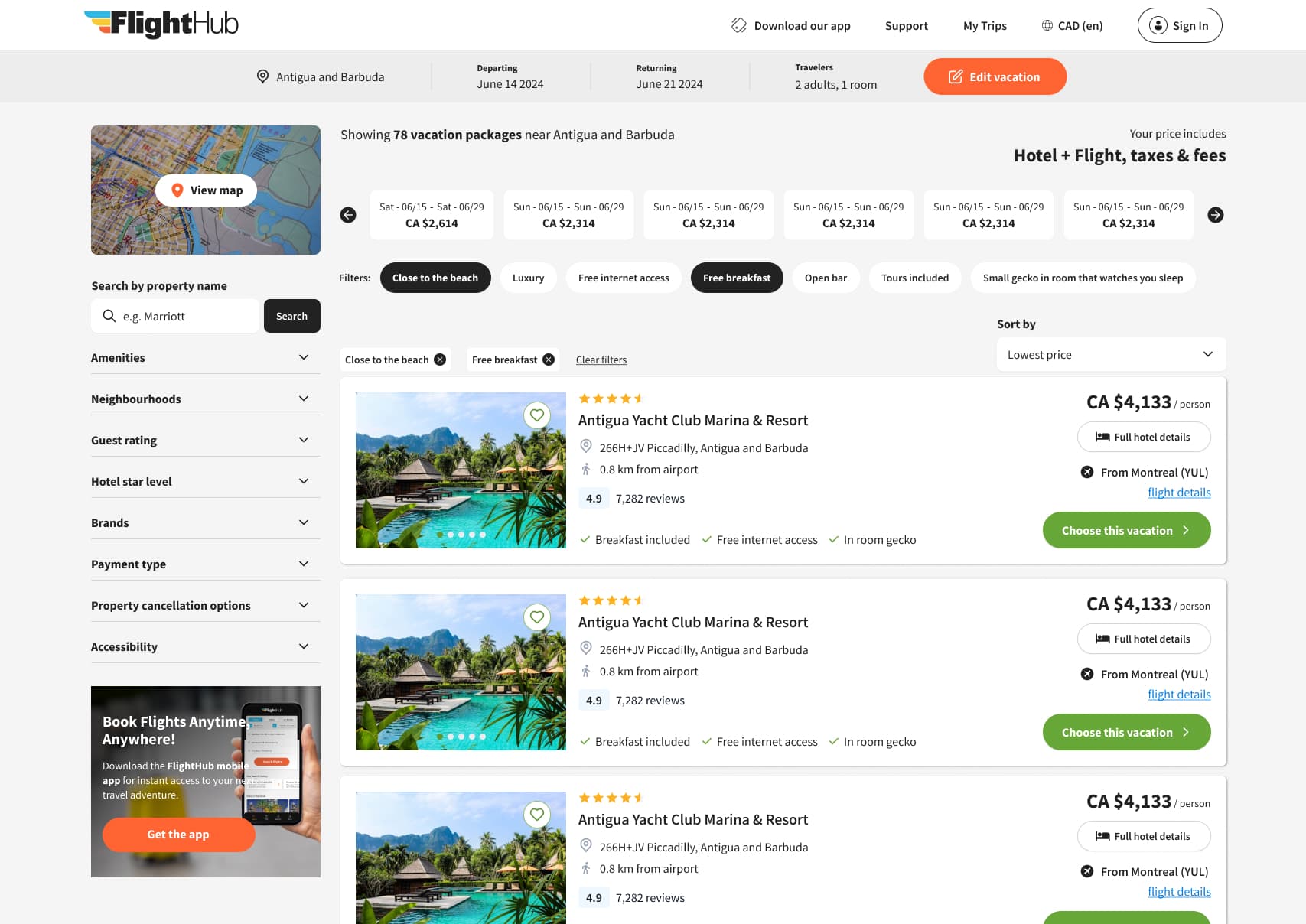
Packages
- Inconsistent card treatments
- Different spacing conventions
- Conflicting button patterns
- Uneven typography and hierarchy
After adopting shared patterns
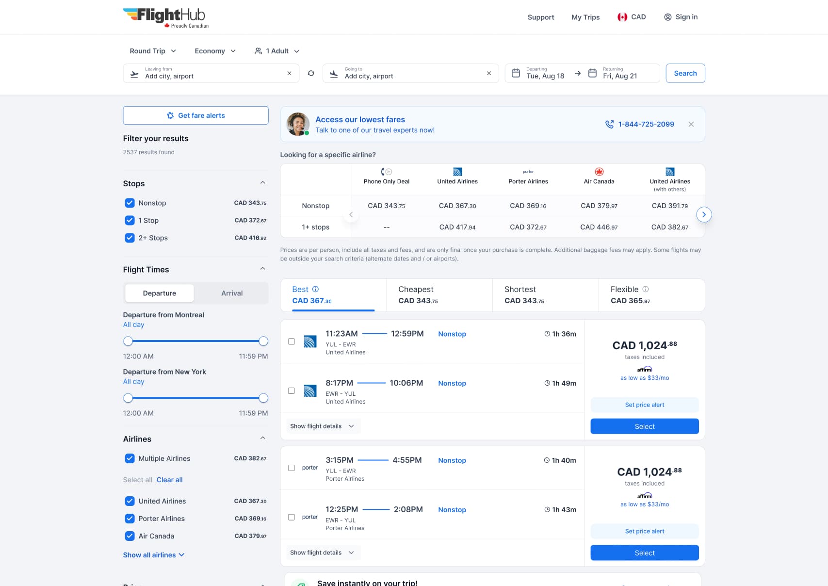
Flights
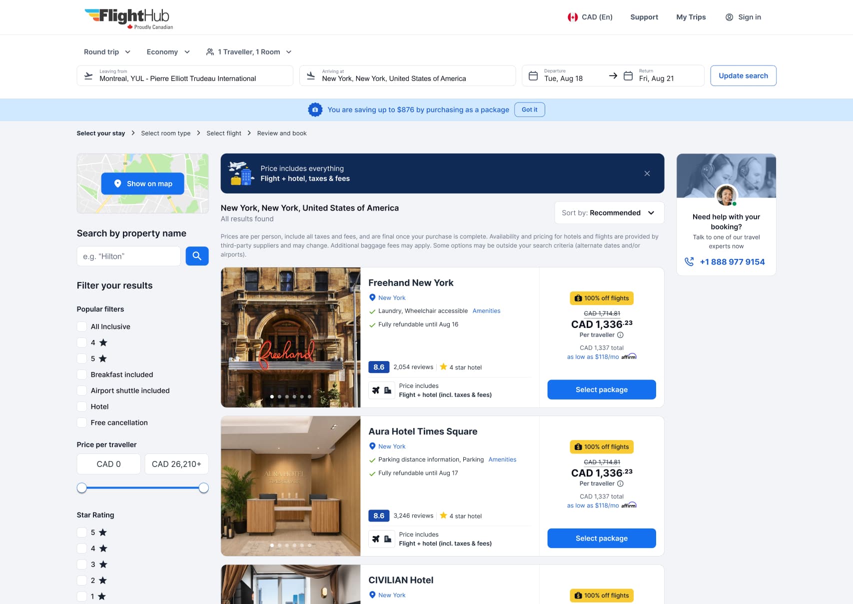
Hotels
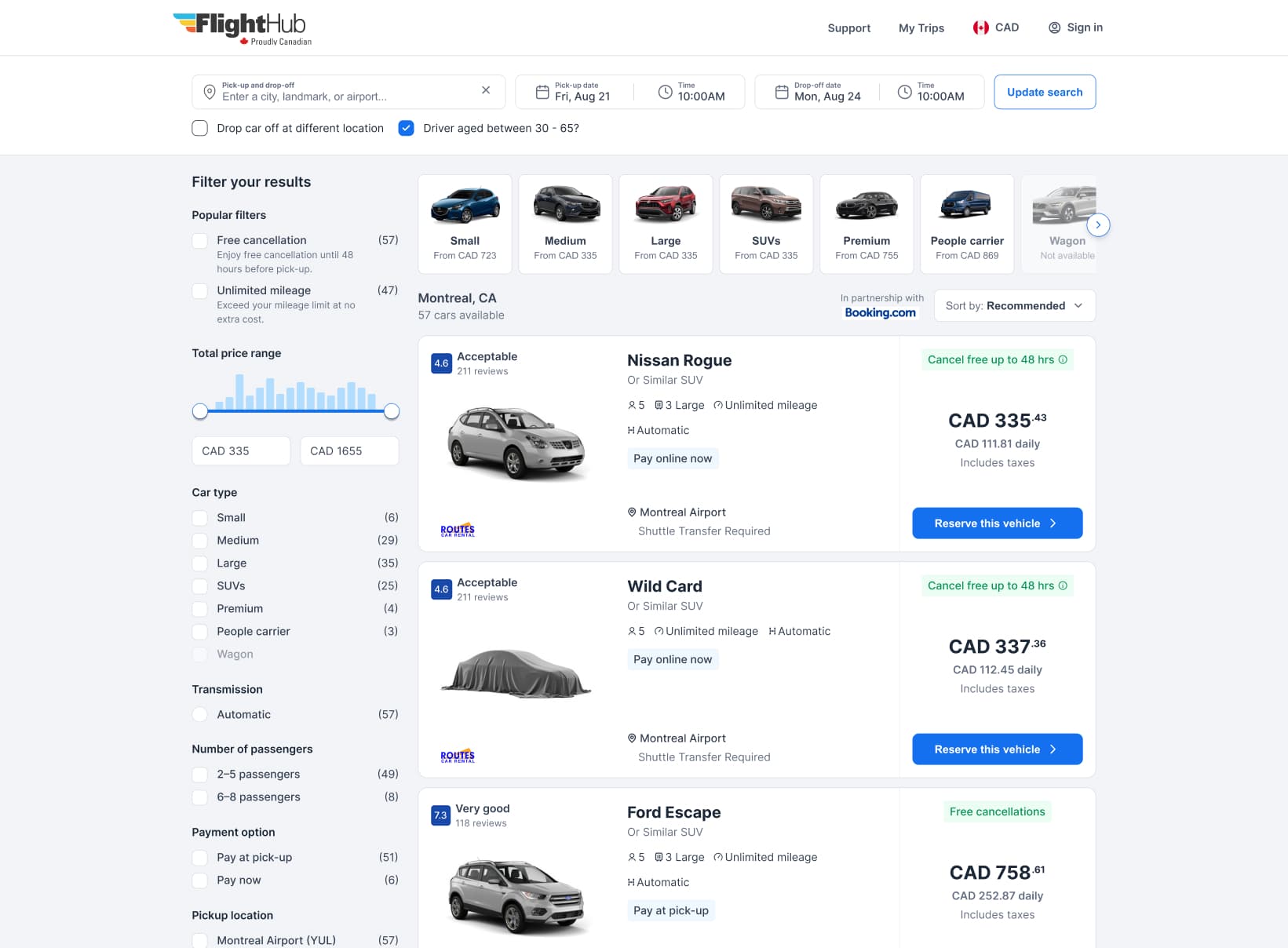
Cars
- Consistent structure
- Reusable components
- Shared interaction patterns
- A more cohesive product language
Recognizing the opportunity
When I began discussing the idea internally, I learned that FlightHub had already attempted to build a design system in the past. The files existed. The documentation existed. People had simply stopped using it.
That discovery reframed the whole project for me. FlightHub had already proven it could build components; what it had never cracked was getting people to keep using them. So everything really came down to one question:
How do we build something people actually want to use?
Building the foundation
I built the system in Figma using Atomic Design principles, beginning with reusable foundations such as typography, spacing, colors, buttons, inputs, cards, and search components.
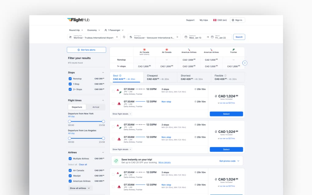
There was no need to reinvent every pattern from scratch. Our newly redesigned Flight Search experience was the most mature product we had at the time, which made it a natural foundation and a practical blueprint for the work that followed.
As the library matured, those foundations evolved into reusable modules that could be shared across Flights, Hotels, Cars, and Packages.
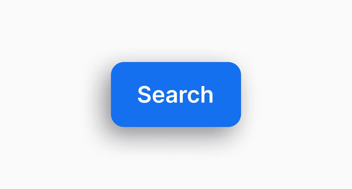
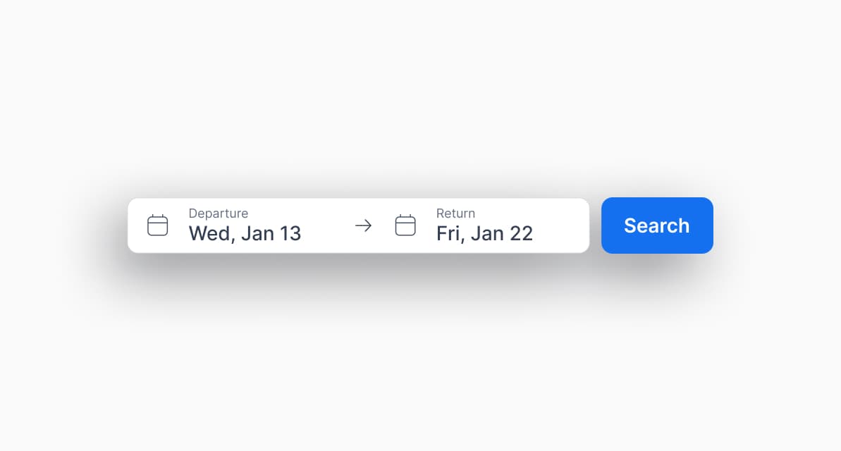
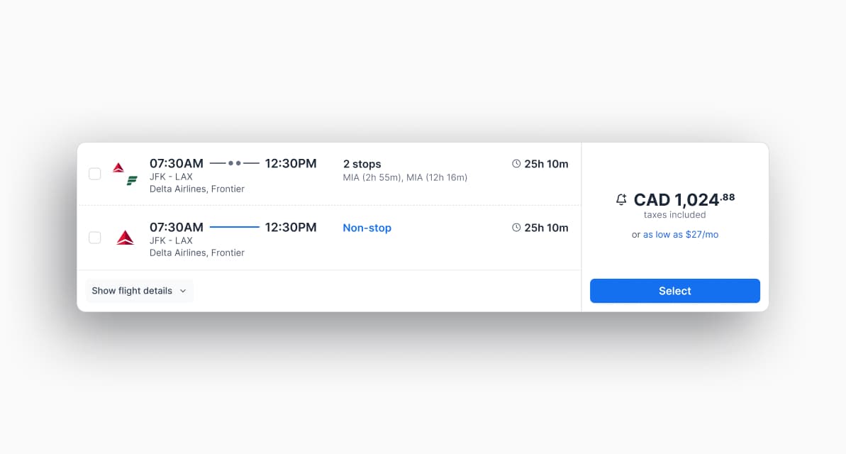
Diagram: a button primitive, a search form, and a result card compose into the full FlightHub Flight Search experience.
Challenging existing brand assumptions
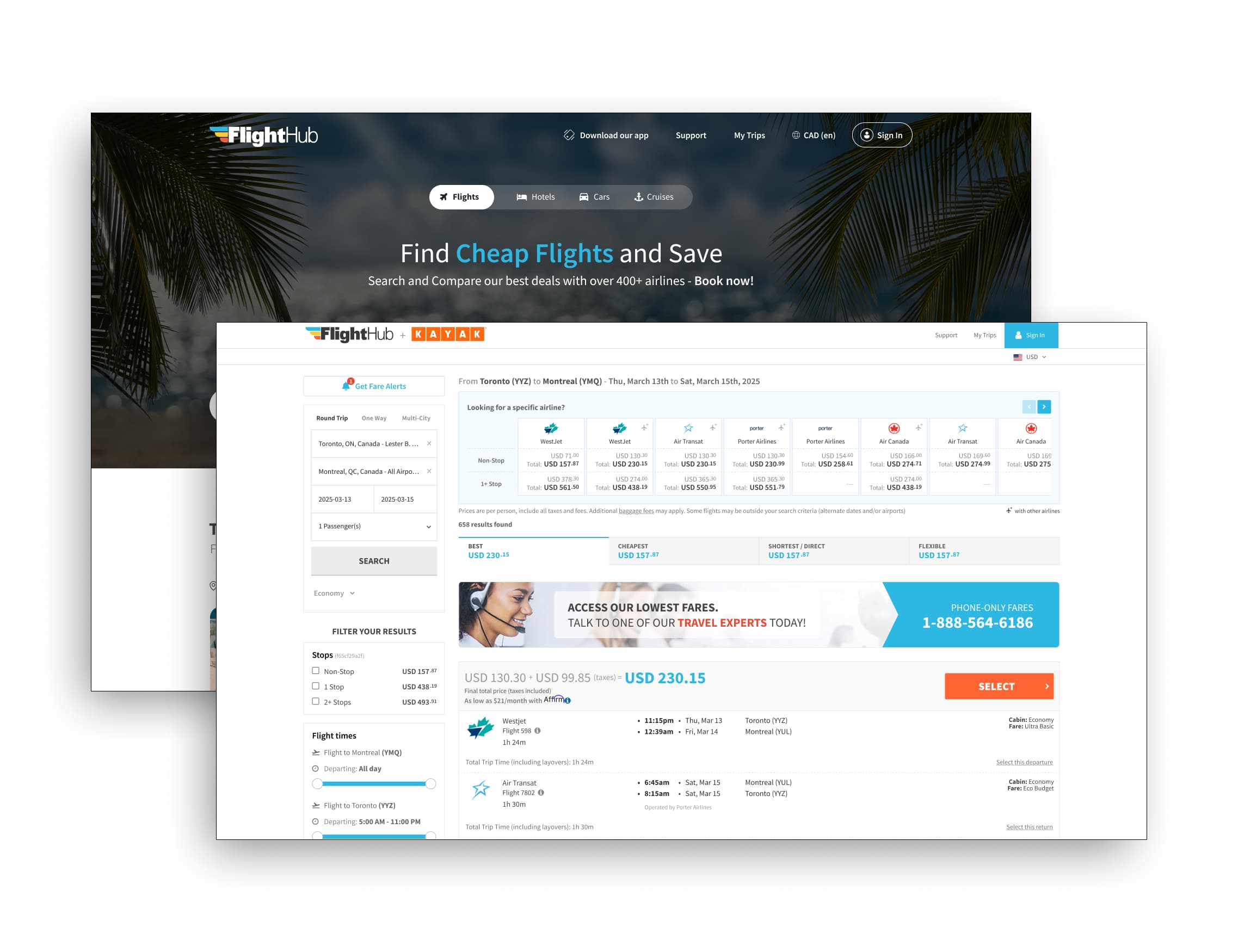
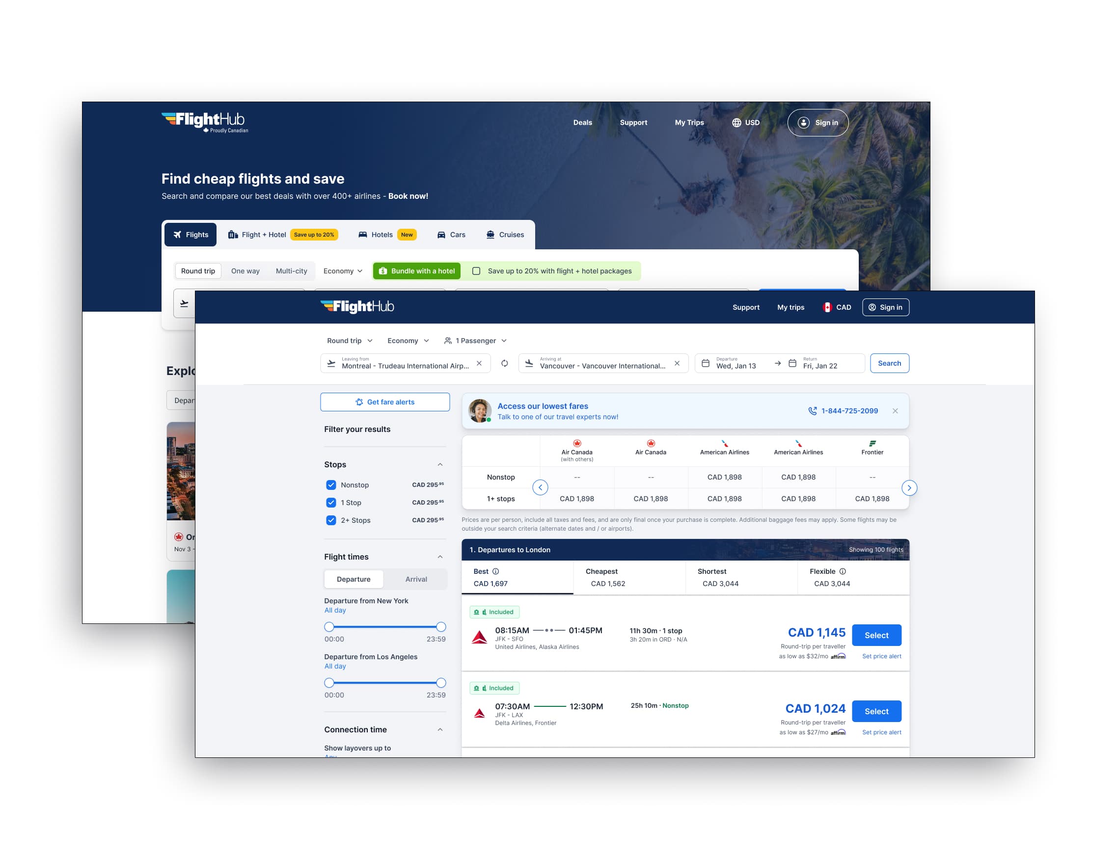
One of the most significant conversations centered on FlightHub’s visual identity. Historically, the product relied heavily on orange, and as FlightHub expanded into hotels, packages, and other higher-value travel experiences, I questioned whether that visual language still communicated the level of trust customers expected during these purchases.
This couldn’t come down to taste. I treated it as a product hypothesis and tested it: I benchmarked leading online travel agencies, reviewed research related to trust and visual perception, and ran internal user testing across different visual directions. The findings consistently pointed toward a calmer visual language centered on blue.
Presenting the recommendation required alignment across Product, Brand, and executive leadership. Grounding the conversation in research and user feedback helped shift it away from subjective preference and toward evidence-based decision-making. The direction ultimately received executive approval and became one of the first major examples of the design system influencing broader product strategy.
Side-by-side comparison of the FlightHub booking experience in the existing orange direction and the proposed blue direction, considered across the primary action, navigation and focus states, and overall visual hierarchy.
Existing orange direction
Proposed blue direction
Adoption was the real product
Creating the components was the easy part. Changing habits was much harder.
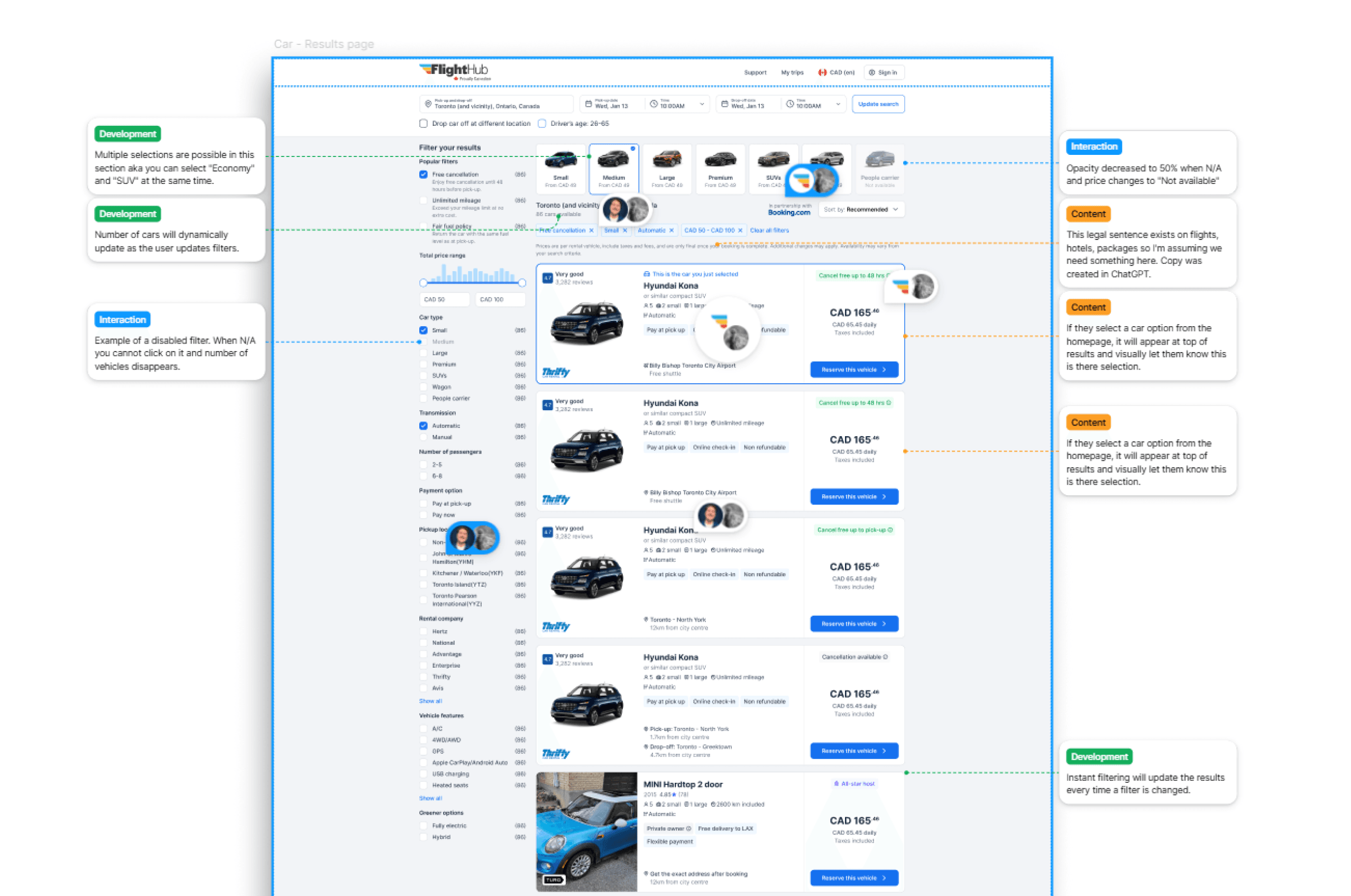
Enforcing rigid rules was never going to change how people worked, so I leaned on education and collaboration. In design reviews, I left comments directly in Figma explaining not just what to change but why. Designers still had room to explore, and exceptions were welcome when they solved a genuine customer problem.
I also partnered closely with Product Managers and design leadership to show how consistency could reduce friction for their teams. Over time, the design system stopped feeling like my initiative; it became part of how the organization made design decisions.
A design-review view: a FlightHub Cars search-results screen alongside review comments encouraging reuse of the shared card component, the established spacing scale, and the existing search pattern.
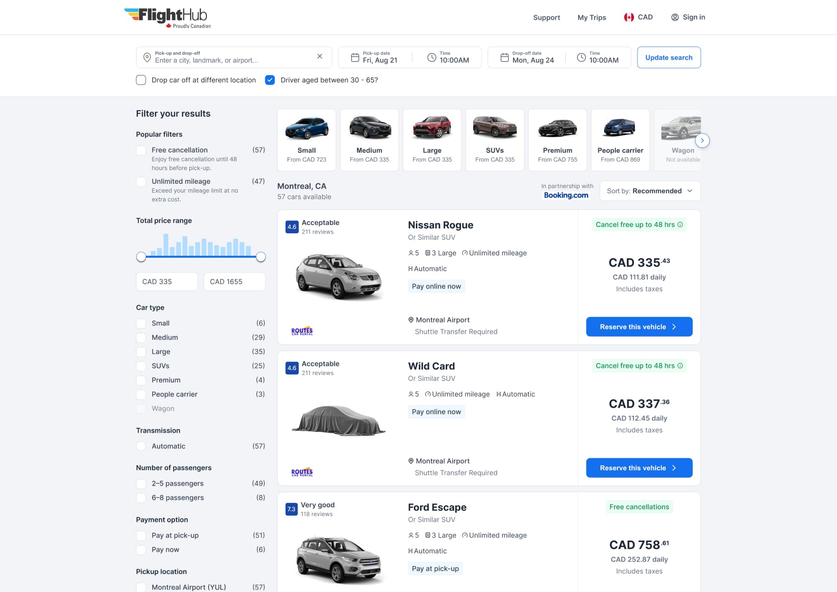
Review comments
Reuse the shared card component
Apply the established spacing scale
The existing search pattern already solves this need
Illustrative examples of the kind of guidance shared in reviews.
AI changed everything
As AI-assisted development became part of our workflow, product managers, engineers, and designers suddenly found themselves capable of creating working prototypes independently. The problem was consistency: those prototypes did not naturally look or behave like FlightHub.
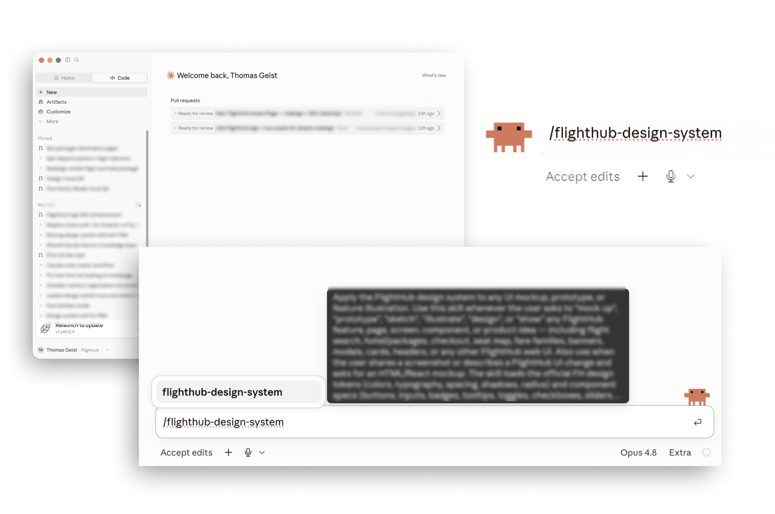
Fighting the shift would have been pointless. I got ahead of it and translated the design system into a Claude Code skill, encoding the same principles and patterns documented in our Figma library. That let people generating prototypes produce interfaces that already reflected FlightHub’s design language from the start.
Somewhere along the way, the design system stopped being documentation and turned into infrastructure.
Diagram: product managers, designers, and engineers can all start from an idea or product requirement, run it through Claude Code with the FlightHub design-system skill to get a FlightHub-aligned prototype, which the team then reviews and refines.
Where it lives today
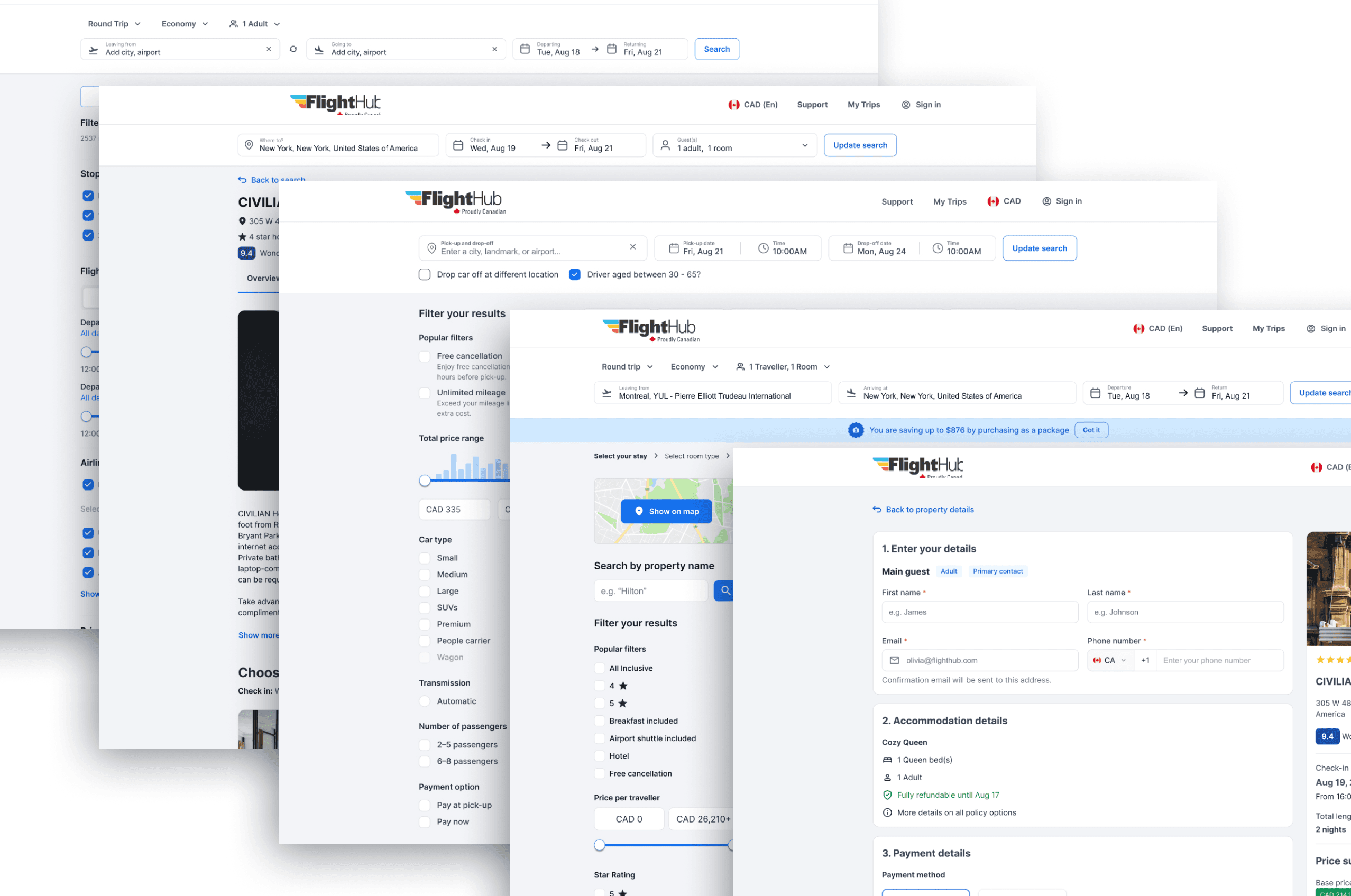
The design system continues to evolve as FlightHub expands its travel products. Today, it supports experiences across Flights, Hotels, Cars, Packages, and AI-assisted prototyping, providing a shared foundation for designers, engineers, and product managers to build more consistent customer experiences.
What began as a component library has become an important part of how products are designed and built across the organization.
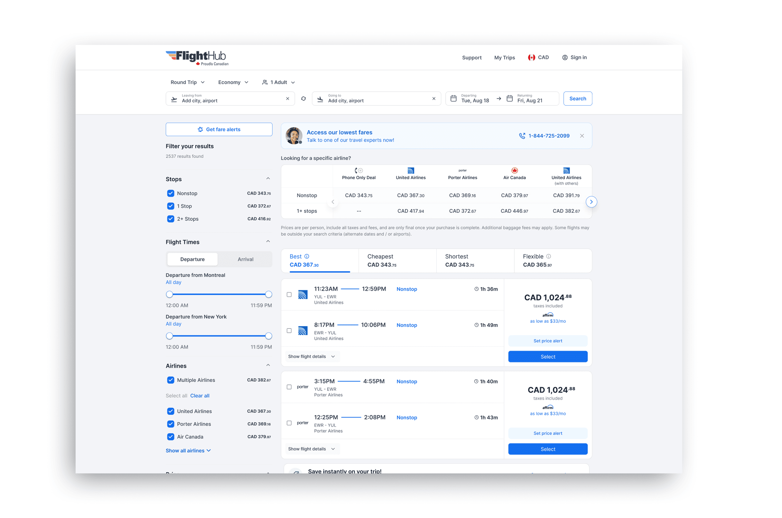
Project gallery
Flight Search
Hotels experience
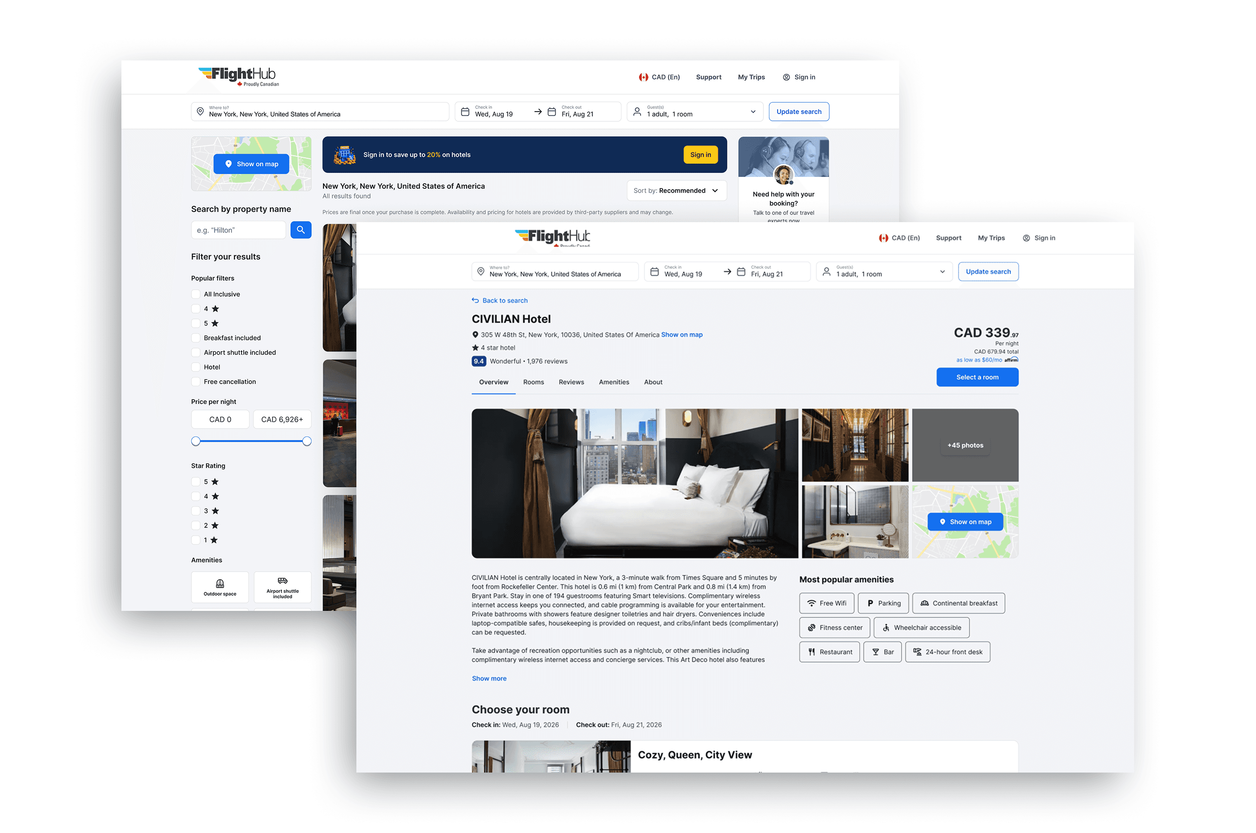
Component library
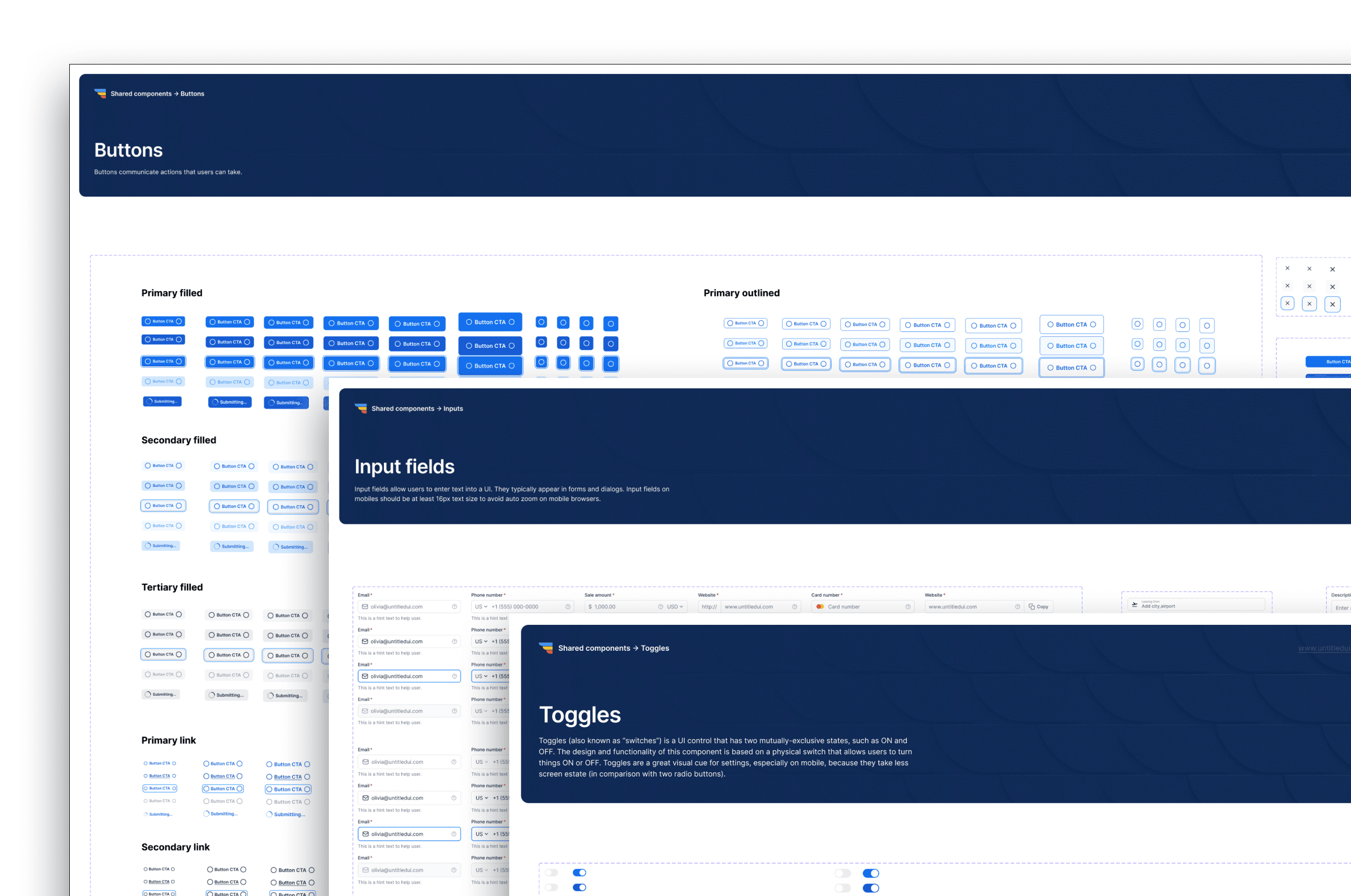
Component evolution
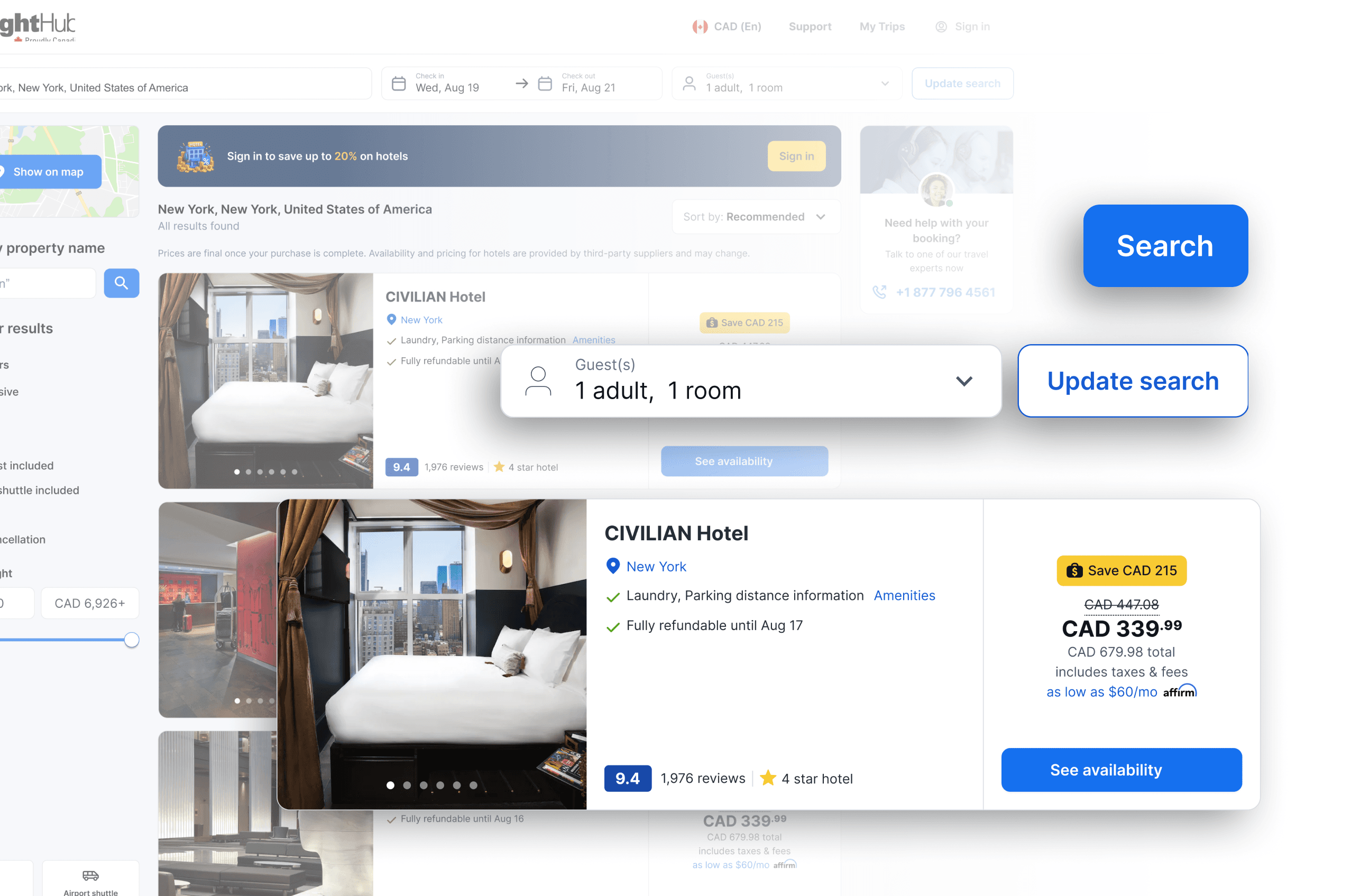
Design review
Color exploration
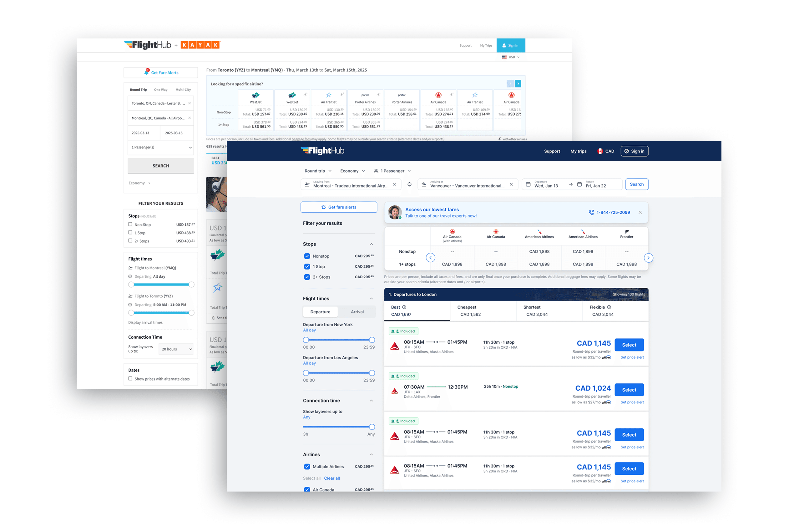
Claude Code skill
Production experiences
Reflection
Before this project, I believed design systems were primarily about reusable components. Today, I see them differently.
They are organizational products.
What I value most about it now is the alignment, even more than the consistency. The component library matters, but the real win was watching designers, engineers, product managers, and leadership make better decisions together. Once AI entered the workflow, that alignment mattered even more: with the design system built into AI-assisted prototyping, consistency came built into the tools people started with; it was no longer something designers had to chase down at the end.
For me, the real measure of success was never the number of components we shipped. It was quieter than that: people across the company started noticing when something simply didn’t feel like FlightHub. That’s when I knew it had become part of how the organization thinks, not just a library people reference.
You know a design system has worked when people stop following it and start thinking in it.